Photography is an art, and like all art forms, seven basic elements comprise our images. Although, I challenge that number, I think there are eight. Understanding these elements helps us to take our creativity to the next level.
The first of these elements is the line. Most of our photographs consist of lines. We use them to guide our eyes around the image, those we call leading lines. They are often confused with lead-in lines that lead us to a subject within the frame.
Lines can also act as blockers, inhibiting the viewer’s eye from traveling beyond a certain point. Horizontal lines across the frame can do just that, and that is typically seen as a bad thing. However, when used intentionally, it can delay the viewer from noticing a feature beyond the line, thus adding an element of surprise to the photograph. Such pictures are less comfortable to look at. Personally, though, I like photographs that are challenging and need a bit of thought to understand.
Shapes are formed by the borders of enclosed two-dimensional spaces created by one or more lines. We probably learned the basic ones – circles, triangles, squares – when we were toddlers. As an aside, my favorite name for a shape is the chiliagon, which has a thousand sides. It’s not the named shape with the most sides; the myriagon has ten thousand sides, and the megagon a million. However, most of us would probably only recognize up to an octagon without having to count the sides.
Shapes can give meaning to an image. For example, the circle can be used to represent equality and unity, as well as the ideas of wholeness and infinity. Triangles, on the other hand, are sometimes used to represent strength. That is why triangles are used a lot in construction.
In photography, we can use shapes for symbolism, as artists and designers have done throughout the ages. However, the meaning of shapes can be swayed by cultural differences. Both the five- and six-pointed stars will have very different meanings in different cultures, depending upon one’s nationality, ethnic background, and political or religious beliefs. Go back in time to before the 1920s and there was a shape that had been used for millennia by Buddhists, Hindus, Jains. In Sanskrit, the ancient Indian language, that shape was synonymous with well-being. Then it was irrevocably hijacked by the evilest regime in humanity’s history. That was, of course, the swastika.
Form refers to a three-dimensional shape. To depict form within a photograph, which is two-dimensional, we are very much relying on the nature of the light and its ability to both illuminate and cast shadows. Therefore, we refer to the light on a gray, overcast day as being flat, as everything within a photo seems to have no depth due to that even lighting. Under flat light, form reverts to shape, and so separation of subjects can be lost.
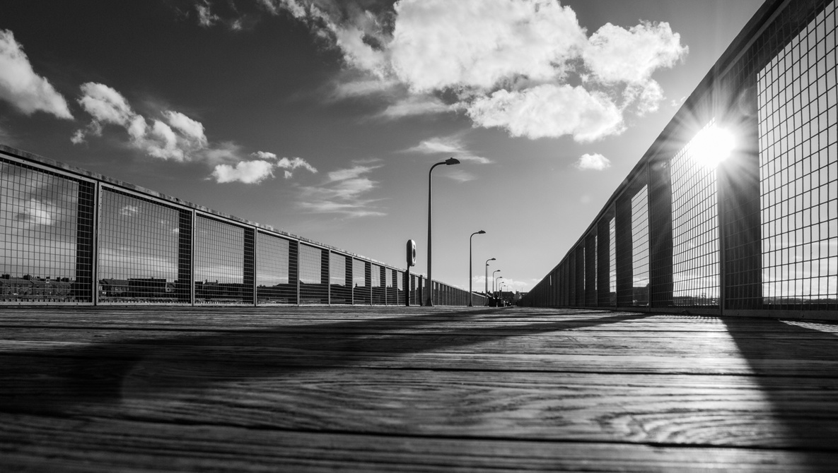
In the photos above, it can be seen that even a little diffused light adds form to the posts in the second image. The first is shot in even light and the image whole image appears flatter. Compare that with the very first photo at the top of this article. There, the light is even stronger and more lowly angled. Consequently, the posts on the left of the frame show more form.
The lightness and darkness of subjects are very much at the forefront of most photographers’ minds. This element is known in the art as value, but in photography, we usually refer to it as luminosity. We give luminosity numbers, with black being 0 and white being 255. Mid-gray is 127. Contrast happens when areas of the photo have different luminosities.
You will see the luminosities applied to the letters RGB, which represent the colors red, green, and blue.
So, color is the next element. By mixing red, green, and blue together in different proportions and with all the available luminosities, we get a wide range, or gamut, of colors. 256 (reds) x 256 (greens) x 256 (blues) = 16,777,216 possible combinations, or hues. We’ve named only a little over 9,000 of those, far too many for me to remember, so using precise numerical numbers is essential.
Colors can also vary in intensity or saturation. Hence, the HSL (hue, saturation, and luminosity) adjustments are available when we are developing and editing photos.
Like shapes, colors can have symbolic meanings too, and sometimes those can be conflicting.
Red can be the color of both love and war. Red lips and red eyes evoke very different feelings. A red-letter day is very different from the letter you receive in red for an unpaid invoice. We can be green with envy, but we want businesses to have strong green credentials. Then, the emotions evoked by a blue sea and sky are not what we would associate with having the blues.
Let’s boldly go to the element of space. That is split into two categories: positive and negative.
Photographers talk about negative space a lot, that is, the space that is around and between the subject. Sometimes, the negative space forms a more interesting shape than the subject itself. Therefore, it can be used to challenge the understanding of a photograph and, like blocking lines I mentioned earlier, can be used to delay the realization of the purpose of the image. It can also be used to juxtapose two different ideas within a single photo.
Positive space is the opposite of negative space and is where the area of interest is within the photograph.
Together, positive and negative spaces are usually positioned in a way that coheres with one of the many rules of composition. Unwarranted criticism is sometimes aimed at photos with too much negative space. However, used correctly, that can be a powerful compositional tool.
The final recognized artistic element is texture. In our mind’s eye, we can conceive of how an object feels by its texture. Smoothness reflects light evenly, whereas rough textures do the opposite and scatter reflected light. In between those two are matte surfaces.
All these elements often work in photos best when contrasts are found within them: light and dark, complementary colors such as orange and blue, curved and straight lines, simple and complex shapes, small and large forms, positive and negative space, and rough and smooth textures. These are just a few of the contrasts proposed by Johannes Itten, the celebrated tutor of the Bauhaus school, whom I wrote about in an article last May.
But what of the other artistic element that I think has been wrongly excluded from the list. That is the single point. That is the basis of all visual elements, a singularity in space and, geometrically, the place where two lines meet. It is something that sits alone within its category and therefore cannot contrast with other points in the way that lines, shapes, and forms can. Nevertheless, it can create contrasts with any of the other elements.
As usual, this is only a brief introduction, just lightly touching the surface of this topic. If you are left wondering about the use of this knowledge, embedding the ideas of these elements into our subconscious will help us to discover new compositions. For achieving that, I would encourage students of photography to treat each element as a topic for a practice photoshoot. That will help you become aware of how the elements of art can impact the structure of photographs.
I hope you found that useful, and I will be expanding this further in a future article. It would be great to hear your thoughts on this topic below.
